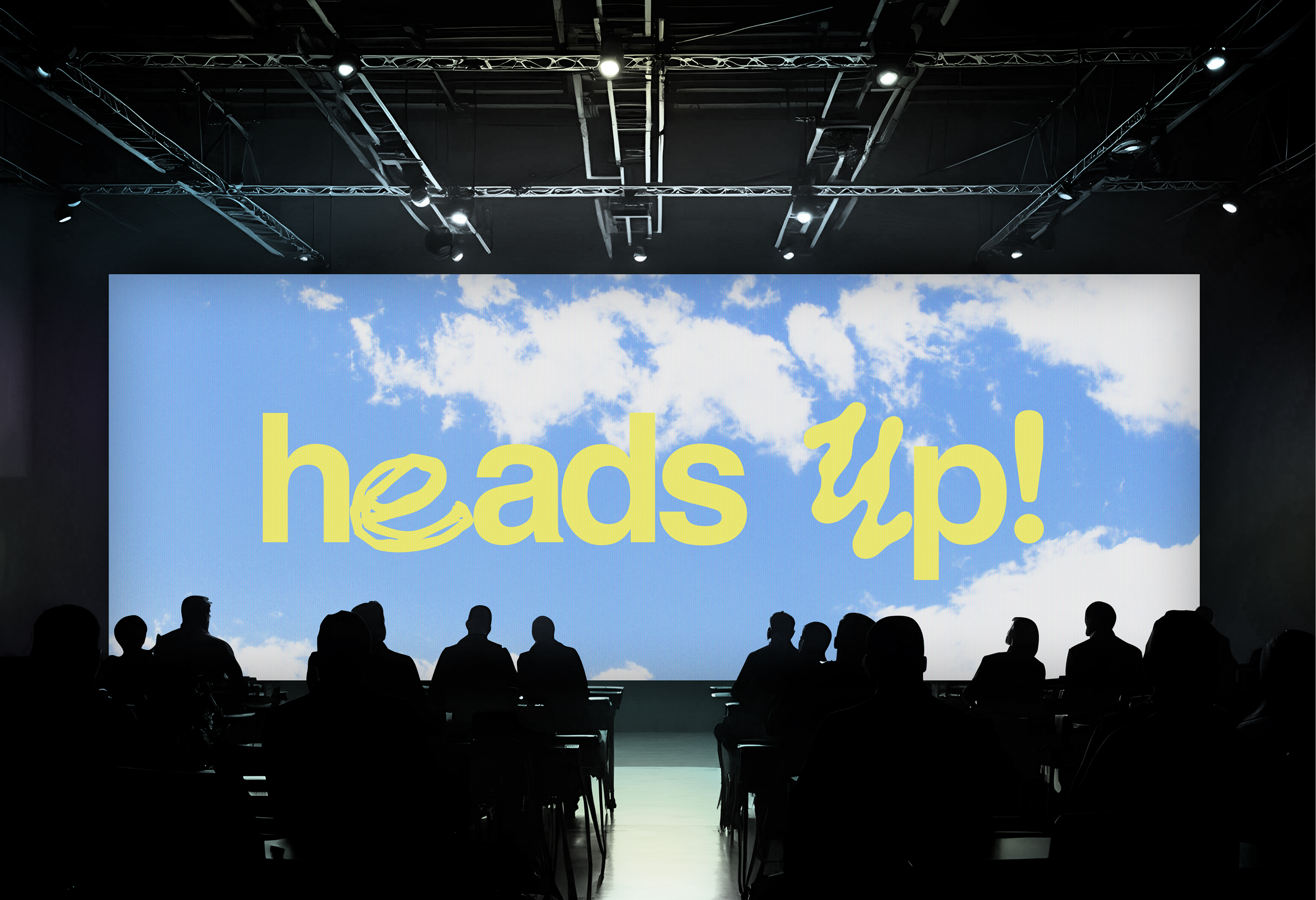
HeadsUp combines two core ideas:
the urgent call to action, to do good while we can - to lead with purpose, to give a Heads up! to those who need it.
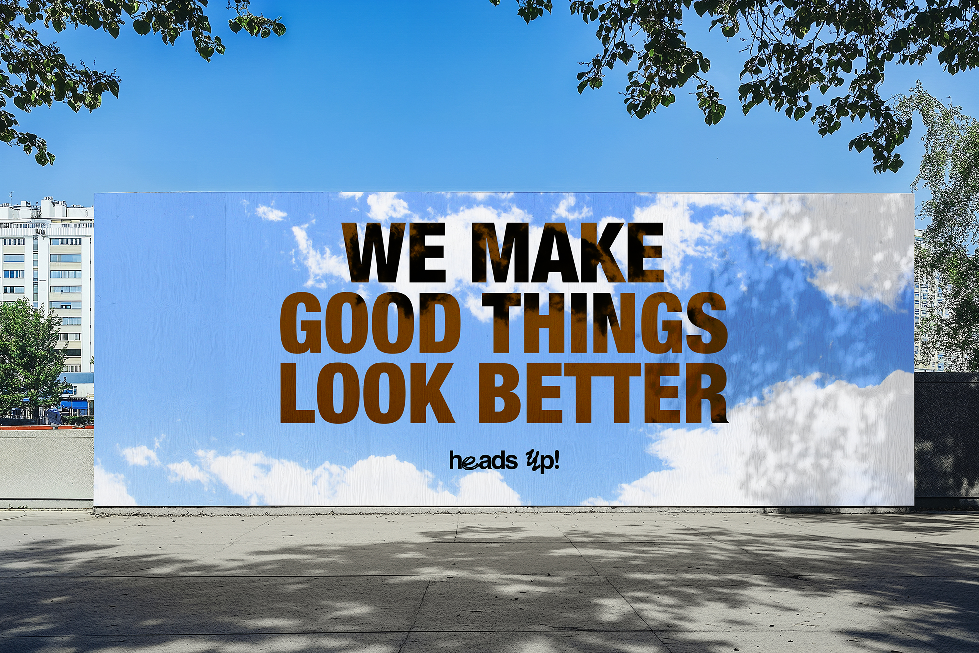
It is also inspired by the beautiful, most dynamic and optimistic design discovered to us when our head’s up - the sky.
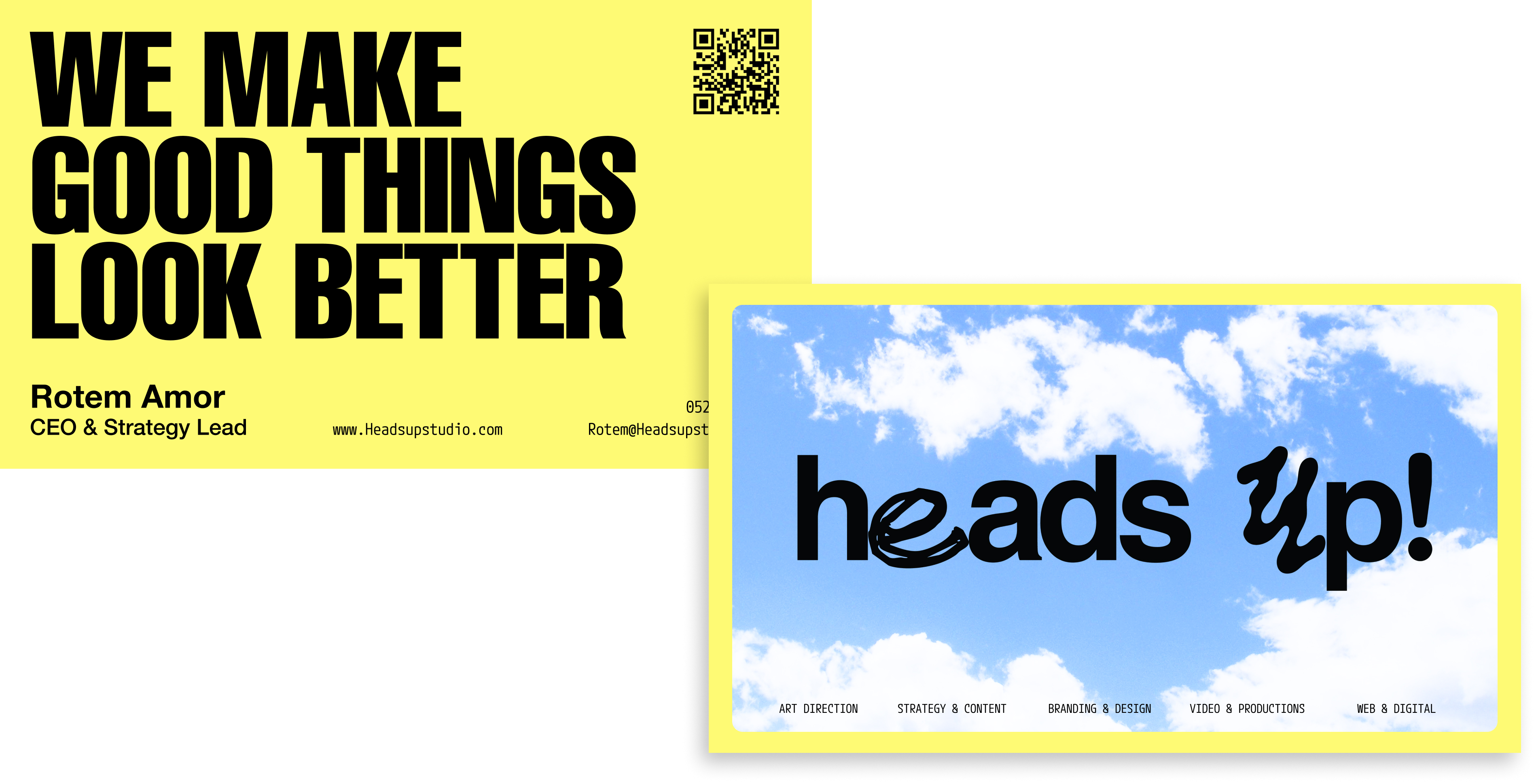
After years of developing visual brands for startups and corporations we found ourselves upon the development of our own tone and look. We wanted to look good, but not steal all the show. After all, our portfolio is this brand's main event and we want to keep it that way.
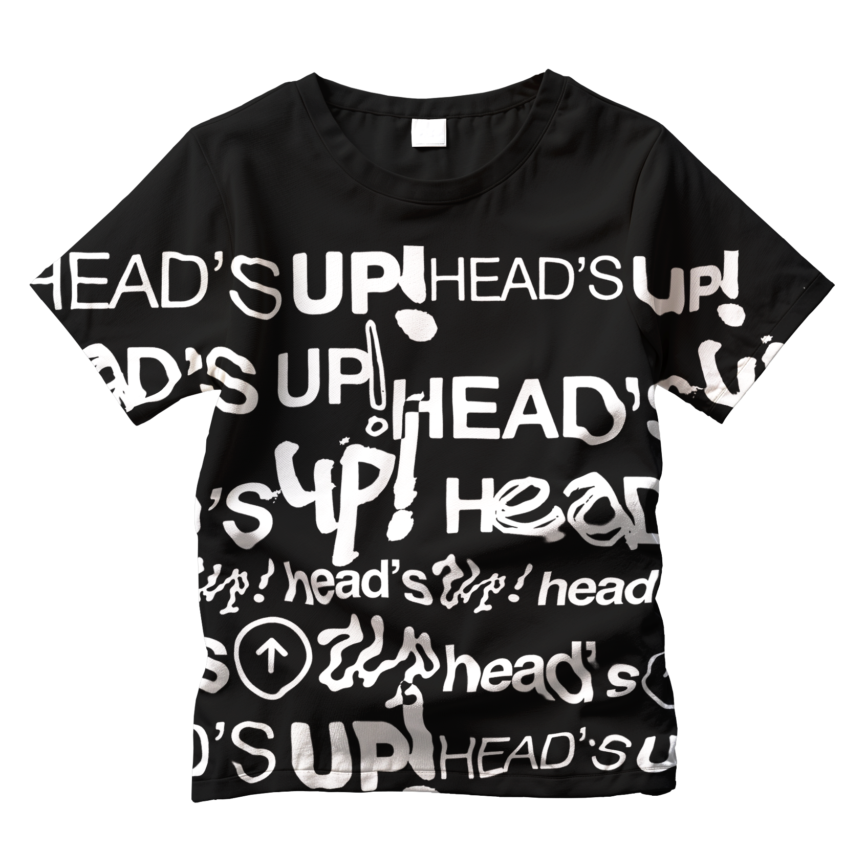
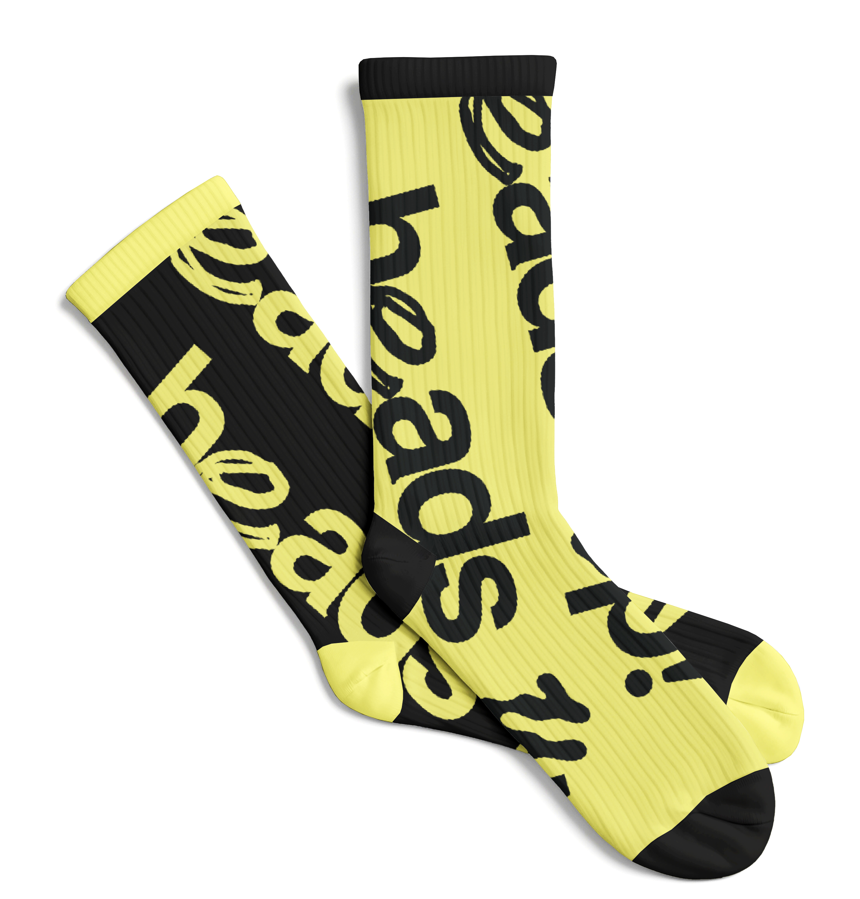
Our logo reflects the balance we aim for - slick and tight, but also playful and open. The palette is minimalistic, letting the blues and yellows bring just enough energy to keep things alive.
Brand strategy and content by ROTEM AMOR
Brand design & Website design + development by IMRY GEFFEN
Logo motion design by THEODORE VOJIK